SEO optimisation: why pixel width has replaced character count for your title tags
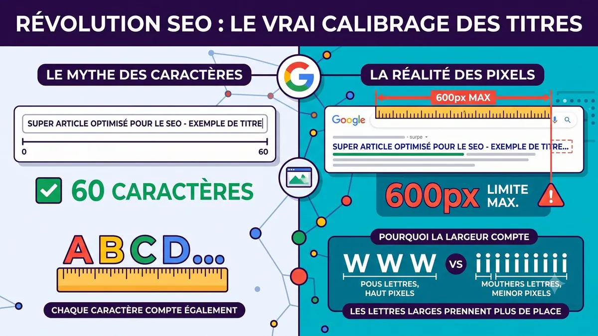
“No more than 60 characters for the title tag”: it is one of the most widespread SEO rules. It is convenient, but inaccurate. In its results, Google does not count letters: it measures the visual space your title takes up. Understanding this nuance lets you write more complete titles that do not end in unsightly ellipses.
Why not all letters are equal
Search engines display titles in a proportional font (such as Arial or Roboto). In this type of font, each character has its own width:
- narrow characters – i, l, t, f, the full stop, the hyphen – take up very little space;
- wide characters – M, W, O, capital letters in general – take up a lot.
The result: a 50-character title written in capitals can be cut off, while a 65-character title full of narrow letters displays in full. Character count is therefore only an approximation.
The real limit: about 600 pixels
On desktop, Google displays the clickable title in a block of limited width, about 580 to 600 pixels. Beyond that, the text is truncated and replaced by “…”. Google does not publish an official figure: these values are observed by SEO professionals and may vary slightly.
| Title width | Zone | Likely effect in Google |
|---|---|---|
| Under 285 px | Too short | Not very descriptive, Google may rewrite it |
| 285 to 550 px | Optimal | Displayed in full in the vast majority of cases |
| 551 to 580 px | Caution | Usually displayed, depending on the characters used |
| Over 600 px | Danger | Almost certainly truncated |
Three tips for titles that display in full
1. Put the essentials on the left
The main keyword and the promise should appear at the start of the title. Users read from left to right and, if the title is cut off – especially on mobile – the important information remains visible. The brand name is best placed at the end.
2. Limit capital letters
A title entirely in capitals uses a lot of width, looks aggressive and does not improve rankings. Keep capitals for the first letter and proper nouns.
3. Choose narrow separators
Between your title and your company name, prefer a dash (–) or a vertical bar (|) to wider separators. They take up very little space and remain readable.
How to check the width of your titles
Several free tools simulate how a Google result is displayed and show the width in pixels: WordPress SEO plugins (Yoast SEO, Rank Math) offer a preview, and many “SERP preview” simulators are available online. Get into the habit of testing every important new title, then check in Search Console how your pages actually appear.
What about the meta description?
The same logic applies: Google truncates the description according to the available space, around 920 pixels on desktop, or roughly 150 to 160 characters. It does not directly influence rankings, but a clear, compelling description improves click-through rate.
In summary
Think in width rather than character count: aim for titles between 285 and 550 pixels, put your keyword first, avoid capitals and use narrow separators. A well-calibrated title displays in full, inspires confidence and attracts more clicks.
Frequently asked questions
How many characters for a title tag?
As a guide, 50 to 60 characters work in most cases, but the real limit is the display width, about 580 to 600 pixels on desktop.
Can Google change my title?
Yes. If the title is too short, too long or does not represent the content well, Google may display different text taken from the page.

A website, SEO or another request?
Design, redesign, SEO, maintenance, AI assistant or just a question: let's talk. Free quote and quick reply.
Request a quote or contact us